There’s so much to think about when it comes to deciding what to post on your instagram.
Not only do you have to consider what to post on stories, reels, grid, IGTV and whatever else appears between me writing this post and you reading it, but you have to have a consistent strategy in place to make sure you’re hitting the right points in your marketing!
While each of the different Instagram functions are important in different ways, your instagram grid is the first thing a potential customer sees when they visit your page.
So, alongside having an optimised instagram profile, you want to be sure that your grid is designed to be more than just aesthetically pleasing; showing your visitors within the top few posts, who you are, what you do and why you do it (all while looking on brand, and put together).
So here is my guide to creating an aesthetic on-brand instagram grid
It will help you keep your grid organised, aesthetic and making it work hard to convert your new visitors into followers.
And at the end, a downloadable template with my complete strategy on how to create an aesthetically pleasing grid without spending too much time on it,
Step 1: Decide on 4 content pillars
First thing you want to do, is decide on FOUR content pillars which you are going to create time and time again.
These pieces of content should aim to educate, inspire or engage your audience.
Some ideas for handmade businesses:
- about me post
- behind the scenes post
- product/sales post
- educational post
Depending on your brand, you may like to swap/change these to something else…
Step 2: Make your content design choices
Next, we want to assign each of these content types a content design style.
- about me post (a photo of you)
- behind the scenes post (a photo of your workspace/market stall)
- product/sales post (beautiful product photo)
- educational post (coloured infographic of upcoming market / exhibition dates )
Step 3: Rinse and repeat these 4 posts in different variations
Now that you have your 4 content pillars you simply need to work out what kind of image you need to post and create a caption that goes with your content pillar.
Feel free to swap and change them where appropriate, but consider your grid aesthetic and make sure you’re still posting the correct coloured/styled post to keep your grid looking fine!
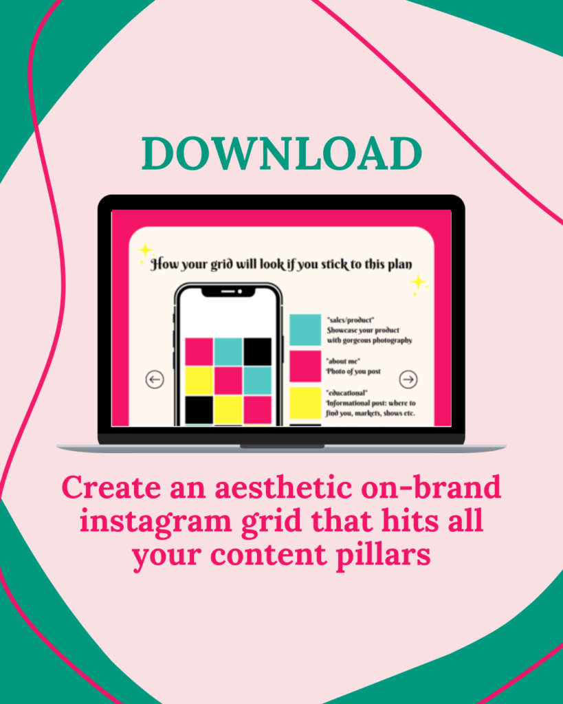
What your grid will look like if you follow this method
Obviously this is a bit less exciting than yours will be, but as you can see it’s consistent, on brand and creates visual interest for the viewer with colour(or style) coding to help them navigate your posts.
Why I recommend designing your grid posts in this way
Deciding what to post on instagram can be hard. You need good photos, you need to come up with a caption, and the options are limitless.
By sticking to this posting strategy, you’ll get the following benefits
✔️ new visitors will always have the most important information at the top of your grid
✔️ you don’t have to decide what to post since you already have a plan.
✔️ coming up with what to say is easy because you already have a theme for the post
✔️ because you’re cycling through these 4 content styles you’ll get a pretty diagonal aethetic to your grid, which will create consistency where before was just a random assortment of photos (see next slide)
Get my free download to help you create your aesthetic on-brand instagram grid
Download this blog post
PLUS a bonus template to write in your own content ideas
PLUS three additional tips to make your Instagram work for you!


